Buick Car Logo Family History
- Buick is an American Automotive Industry founded on May 1903 by David Dunbar Buick.
- It is a currently division of General Motors (GM).
- Its headquarter in Detroit Michigan.
- Its area is only served in the united states. Canada, Mexico, and China.
- Webiste: http://www.buick.com
1903 – 1905
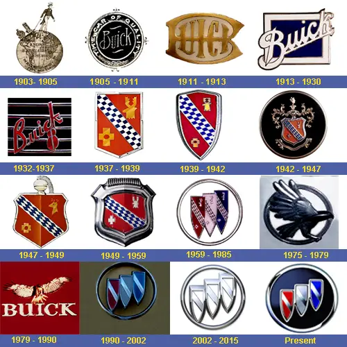
BUICK Started 1903 to 1905 we have a man with i don’t know some kind of cane and he’s walking on earth he’s walking on earth.
1905 – 1911
In this logo there are two words of Buick here in the center of the circle right here and on the rim of the circle it says the car of quality.
1911 – 1913
We have some kind of symbol right here with the a line and i realized i think it’s just a B and we have the words uick so it’s like BUICK with Copper Golden Color.
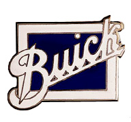
1913 – 1930
We have the word BUICK in script text it’s white and here we have a blue square and we have another square that is white and here we have another square that’s kind of like beige and here we have got a square that’s white.
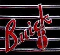
1932 – 1937
This is just the front of car way back in the 1930’s which was the decade of the great depression so here we have the word Buick and red Text and here some kind of shred shapes i think it looks like a ladybug with those shapes being combined.
1937 – 1939
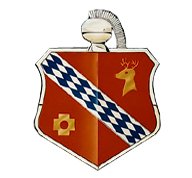
This was their coat of arms here we have like a shield and it’s bad our kind of looks like a game of chess and and here we have like yellow cross and another yellow saying.
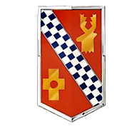
1939 – 1942
Buick logo it looks like same like previous but some changes the color is red and its shield shape with diagonal blue chess.
- 2017 Range Rover SV Autobiography Dynamic Metallic Red 1/18 Diecast Model Car by LCD Models

- Price: $149.95
1942 – 1947
It has been modified we have the coat of arms right here we the moose and we have some kind of thing right here we have the checkers banner and here some kind of golden thing and some background is Black.
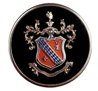
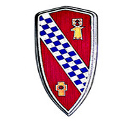
1947 – 1949
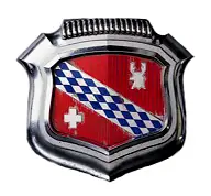
In which shows the shield is kind of that widening. Blue diagonal chess shape with under two small images.
1949 – 1959
In which logo use red color but shape same as previous but in silver and chrome style.
1959 – 1985
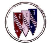
Here we have three shields three of the same shields which are red white and blue.united states of america and it’s inside a silver circle.
1975 – 1976
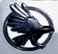
It changed to an eagle with round shape in a circle.
1976 – 1990
Here we have an eagle logo design and it’s flying off the eye and here we have to wear Buick well and also it’s in a red background.
1990 – 2002
Welcome back three shield of three colors red white and blue so here shields have been reused except there are no like animals on it and it’s not like a chest banner anymore and it’s inside a sliver circle also often the metal one is more like grey not whites and we have the trade mark word BUICK in blue text.
2002 – 2015
We have an alternative version where it’s kind of like advanced but its all silver.
2015 – Present
Finally in the present design welcome back with three shield of red white and blue. they’re back to the colors again has been used for three years now there’s 2019 and we have the word BUICK.
Here are some frequently asked questions (FAQs) about the history of the Buick logo:
When was the first Buick logo created?
The first Buick logo was created in 1904 by Buick’s founder, David Dunbar Buick. It featured a stylized monogram of the letters “B” and “D” in a circle.
What does the Buick logo represent?
The Buick logo is known as the “Trishield” logo and features three shields arranged in a diagonal pattern. The logo represents the three pillars of Buick’s brand identity: style, luxury, and performance.
When was the Trishield logo first introduced?
The Trishield logo was first introduced in 1959, replacing the earlier “Dynaflow” logo that featured a stylized “B” inside a gear.
Has the Buick logo changed over time?
Yes, the Buick logo has undergone several changes over time. In addition to the Dynaflow and Trishield logos, there have been variations featuring different lettering and color schemes.
What is the current Buick logo?
The current Buick logo is an updated version of the Trishield logo introduced in 2017. The new logo features a more streamlined and modern design, with the three shields arranged in a flatter, more horizontal pattern.
Why did Buick update its logo?
Buick updated its logo to reflect the brand’s renewed focus on innovation and modernity. The updated logo is meant to convey a sense of forward-thinking and progress, while still honoring the brand’s rich history and legacy.
Are there any hidden meanings or symbols in the Buick logo?
There are no official hidden meanings or symbols in the Buick logo, but some fans have pointed out that the three shields could represent the three Buick brothers who founded the company: David Buick, Charles Buick, and Thomas Buick. However, this is purely speculation and has not been confirmed by Buick.

